

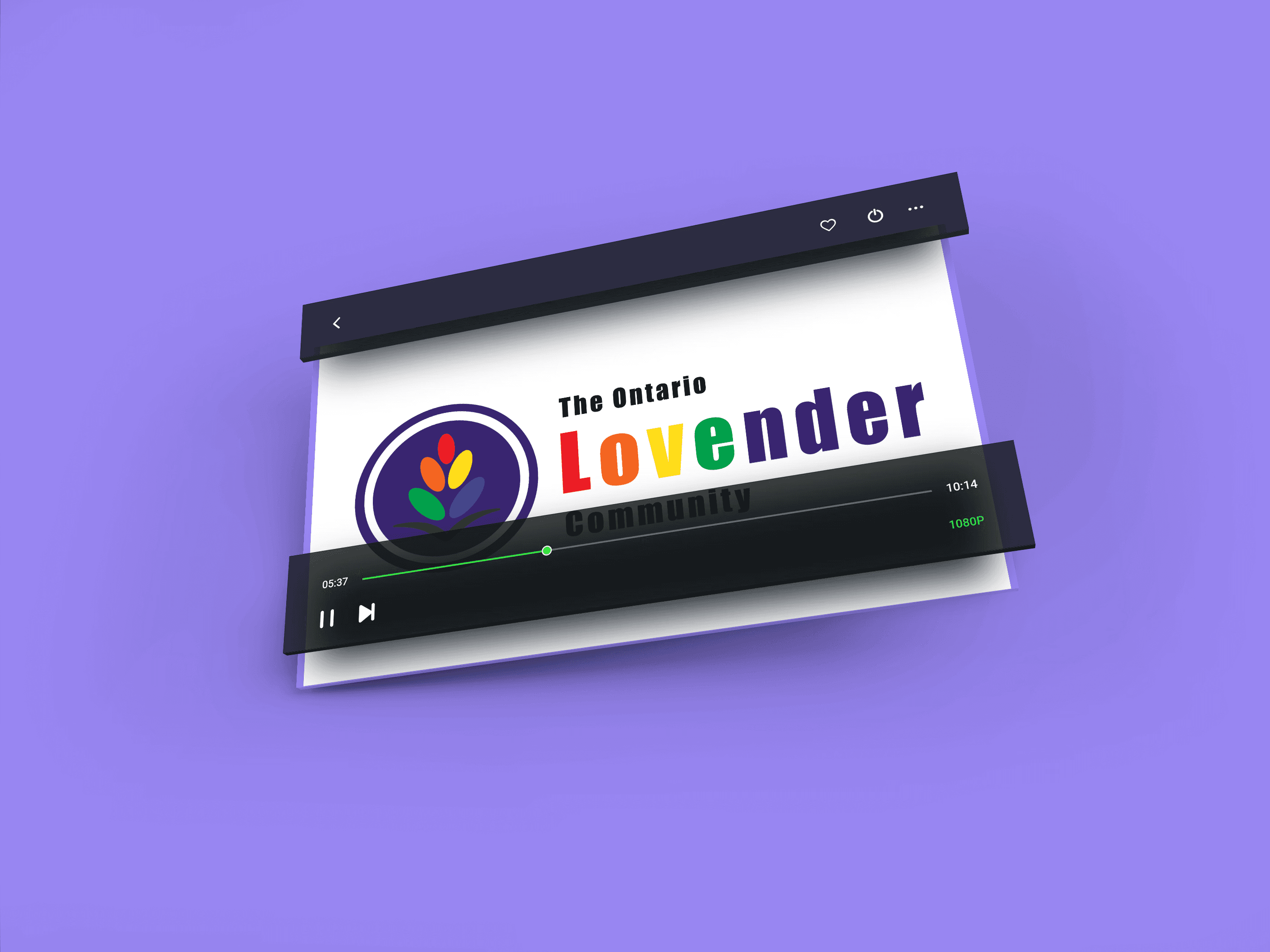
The Ontario Lovender Community is a non-profit organization that supports LGBT+ youth by providing a safe, anonymous, and educational platform. As part of the founding team, I played a key role in shaping the brand identity and visual language of the organization.
My work focused on building a brand that feels safe, approachable, and empowering, while communicating trust and inclusivity to a young audience navigating identity and self-discovery.

About Lovender
Role: Co-Founder & Brand Designer
Tools: Adobe Illustrator, Adobe Photoshop
I led the development of the visual identity and contributed to early brand strategy, including
Logo design and refinement
Visual system development
Social media graphics and content direction
Brand consistency across platforms
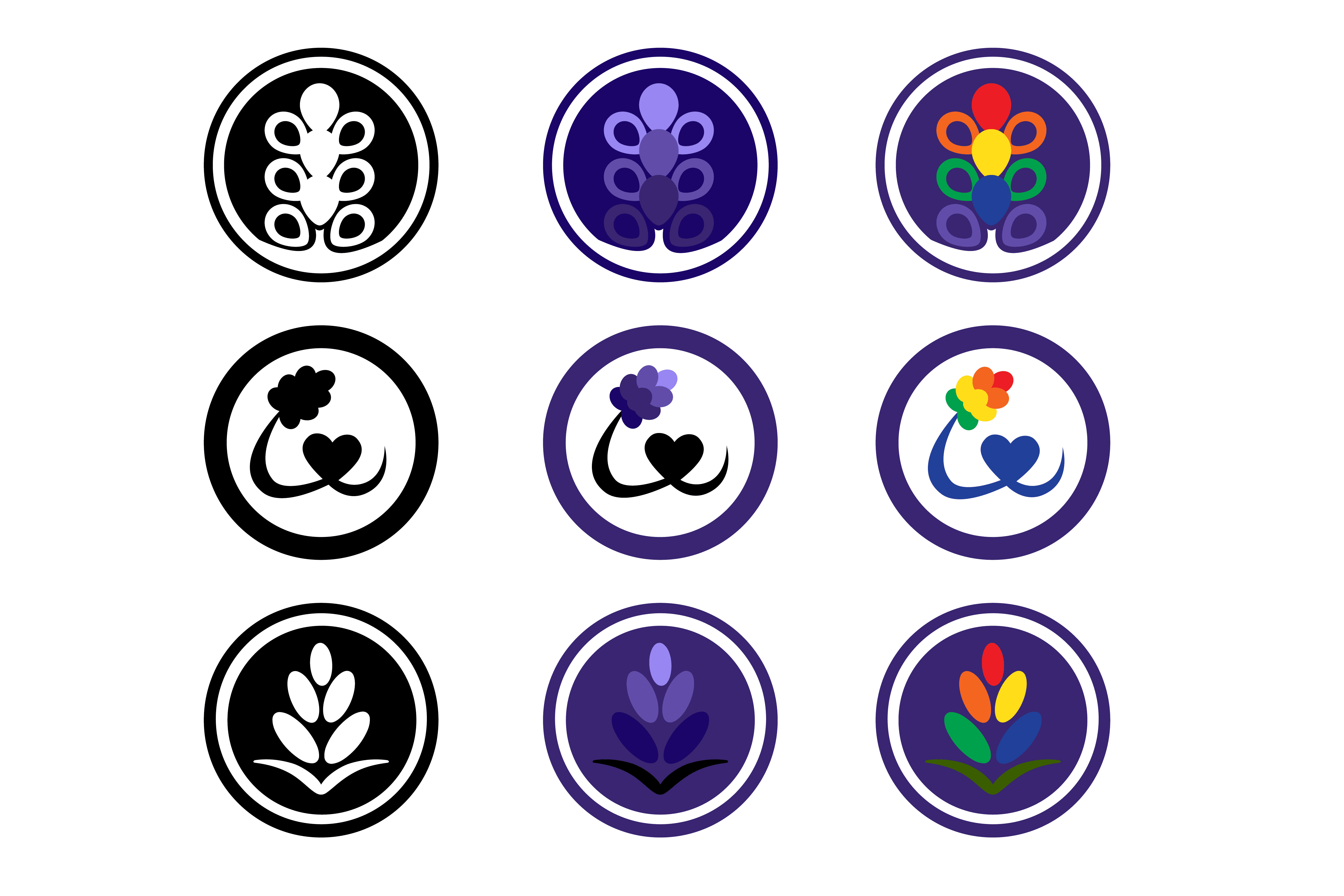
Brand Concept
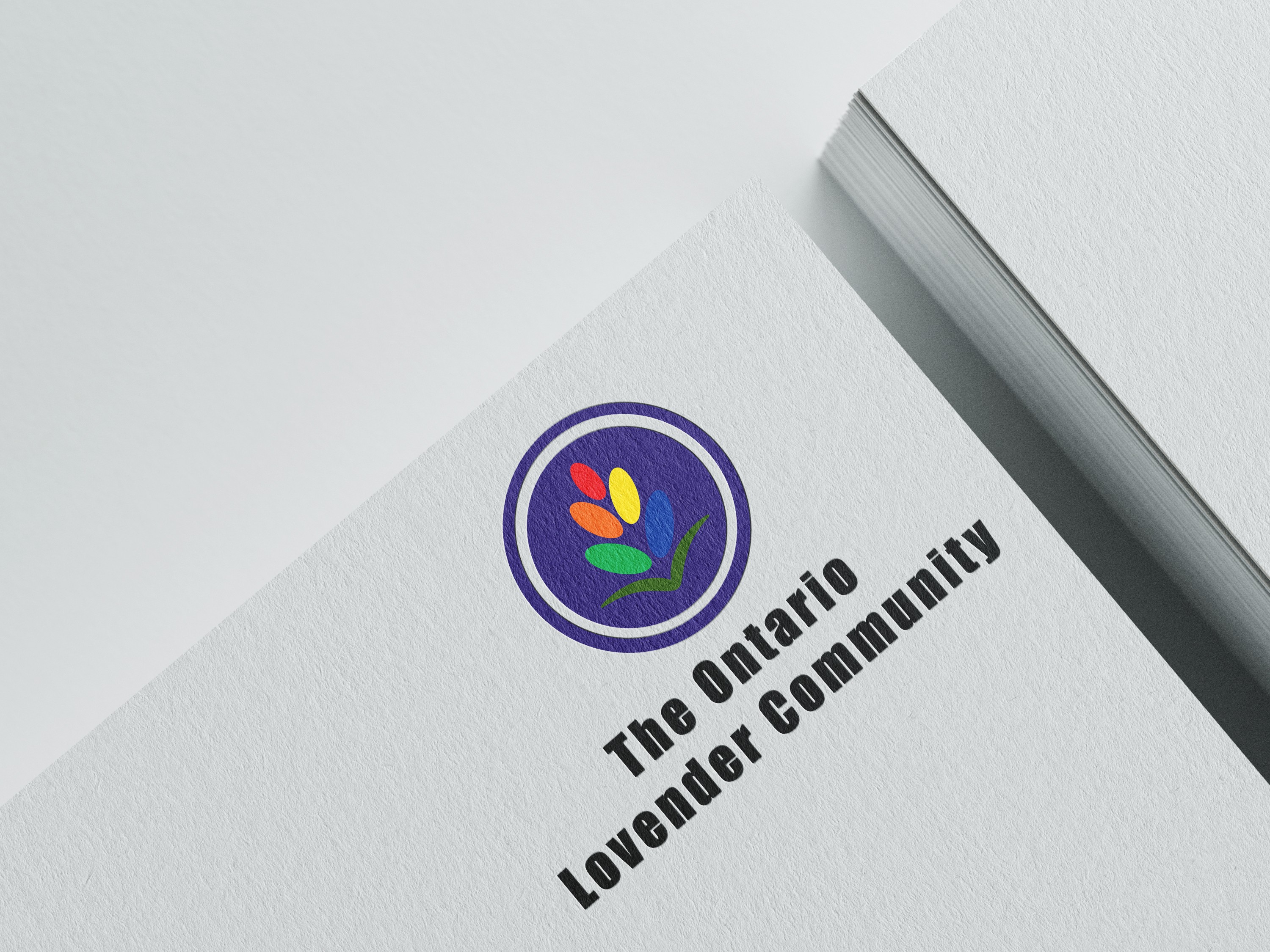
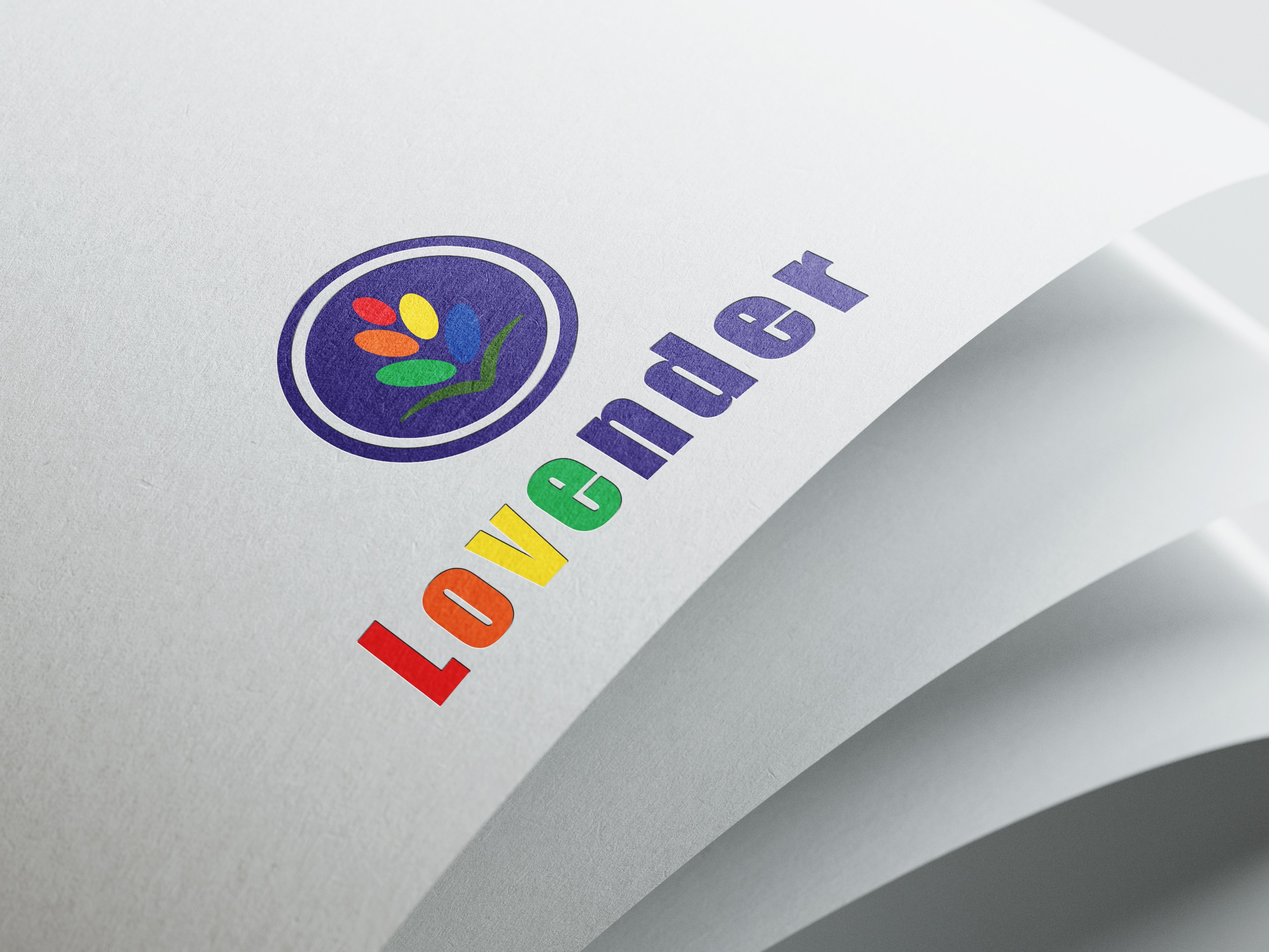
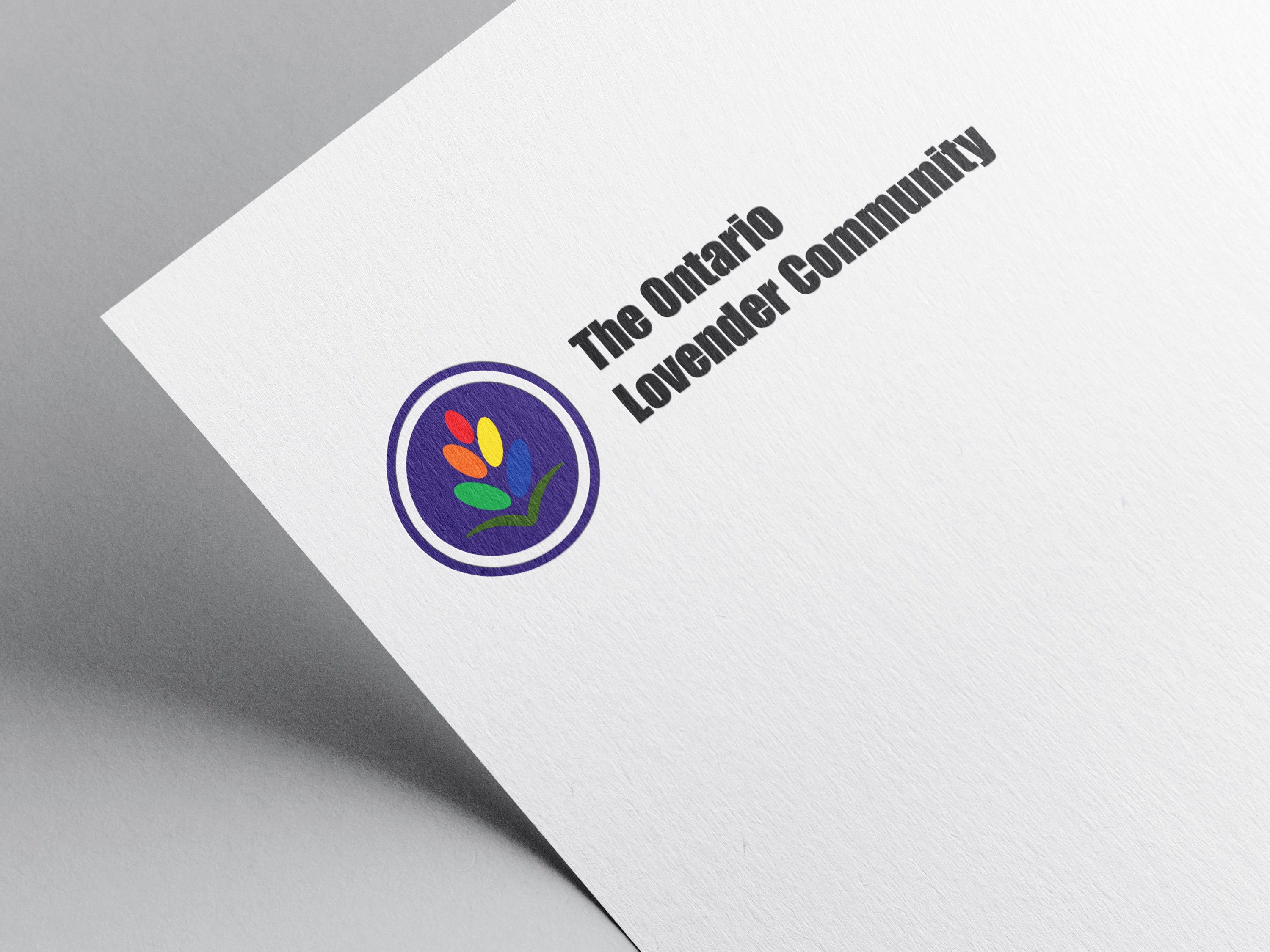
The name “Lovender” combines “love” and “lavender.” Lavender carries historical significance within the LGBT+ community, symbolizing both past struggles and present empowerment. Reclaiming this meaning allowed the brand to connect emotional warmth with cultural depth.
Creative Process


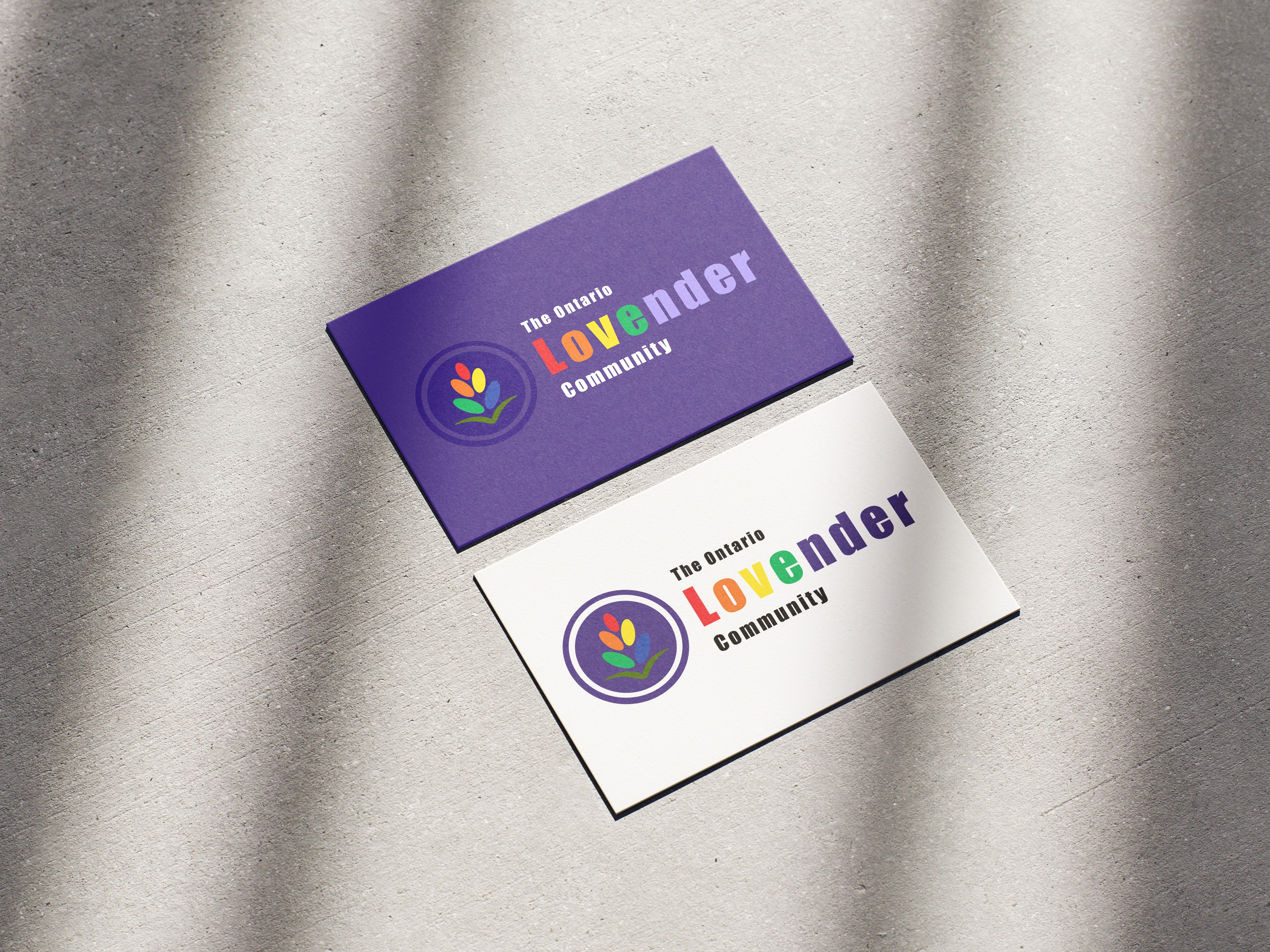
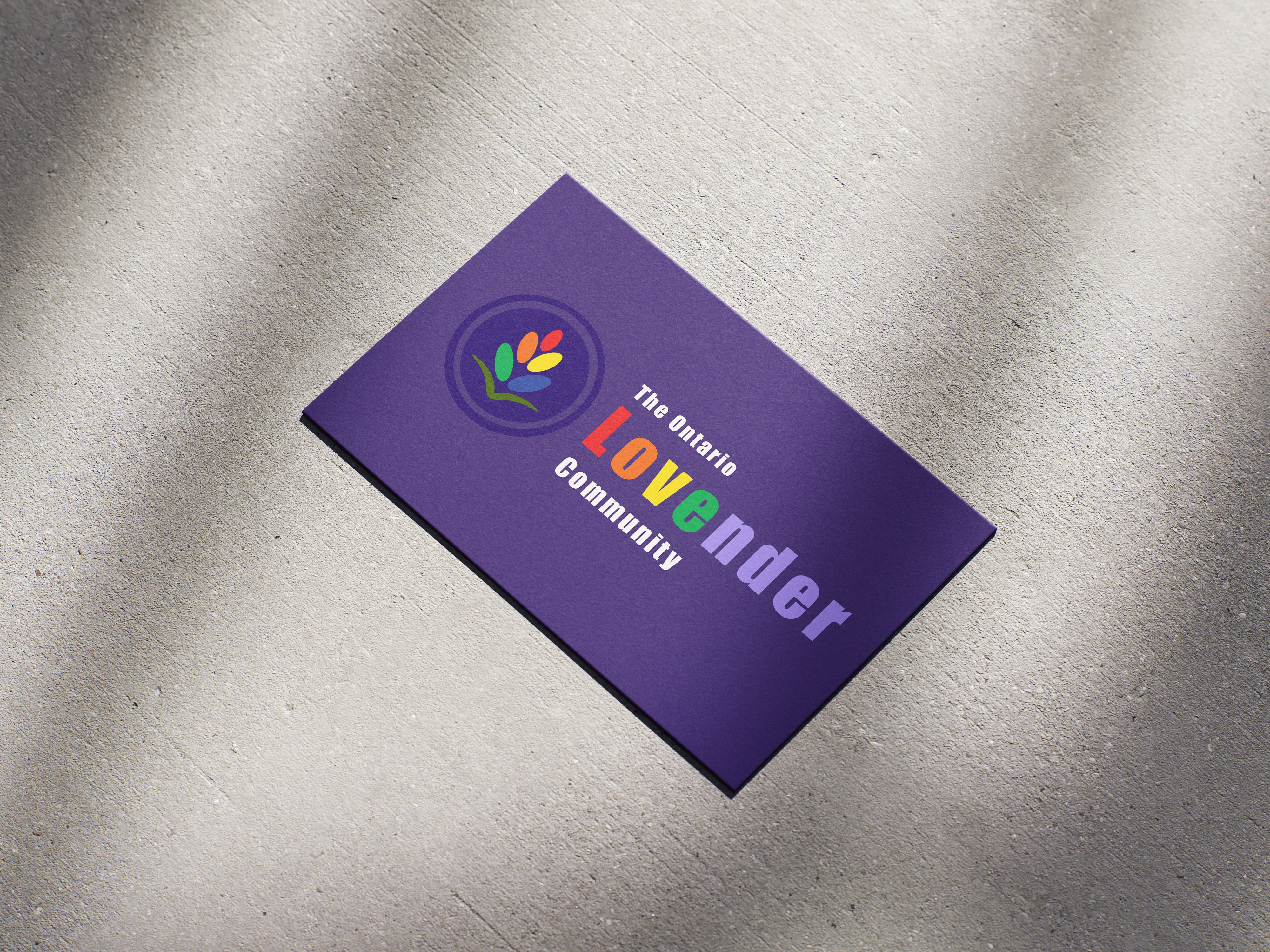
Applications

Credits
Mockups by MockupBro and Mockups Design


